UX/UI Nat Geo Kids Redesign
PROBLEM: Natgeokids.com was on a separate instance of AEM (Adobe Experience Manager) which made development changes expensive. Our mandate was to make as few changes to the front end as possible for budget reasons while still honoring our visual identity and audience. This project would allow us to take advantage of any new development work done for national geographic.com, ultimately saving both time and money.
SOLUTION: I started with the Sketch document (above) from the UX designers on the nationalgeographic.com team and started to apply our visual brand identity, always keeping the user, kids ages 8-12, in mind as I made changes. Since our users mostly came to the site on a desktop or laptop computer, I started with larger screen visual designs and moved onto mobile particularly when investigating the new navigation.
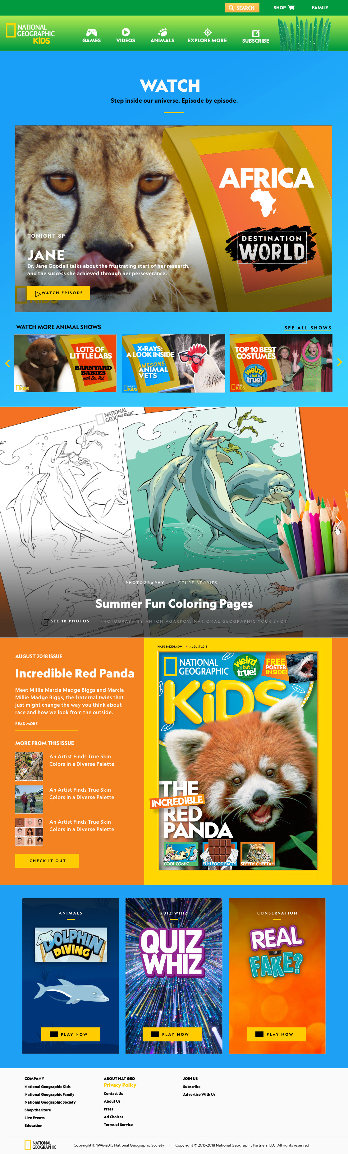
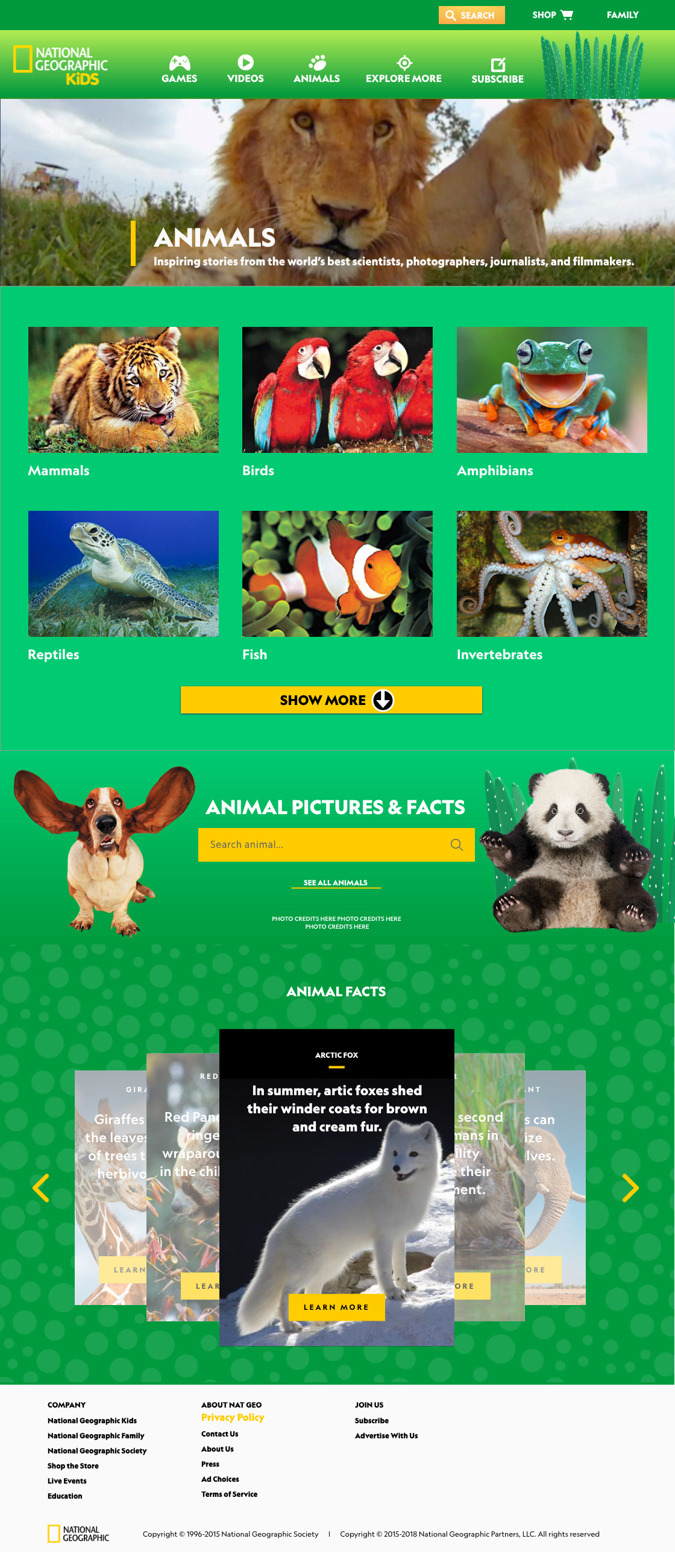
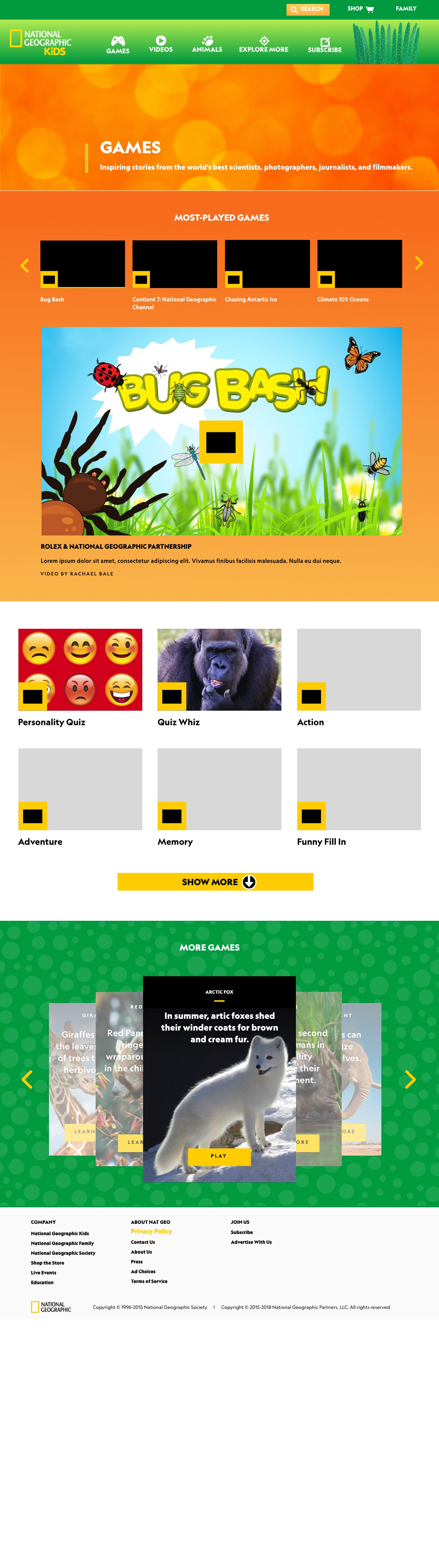
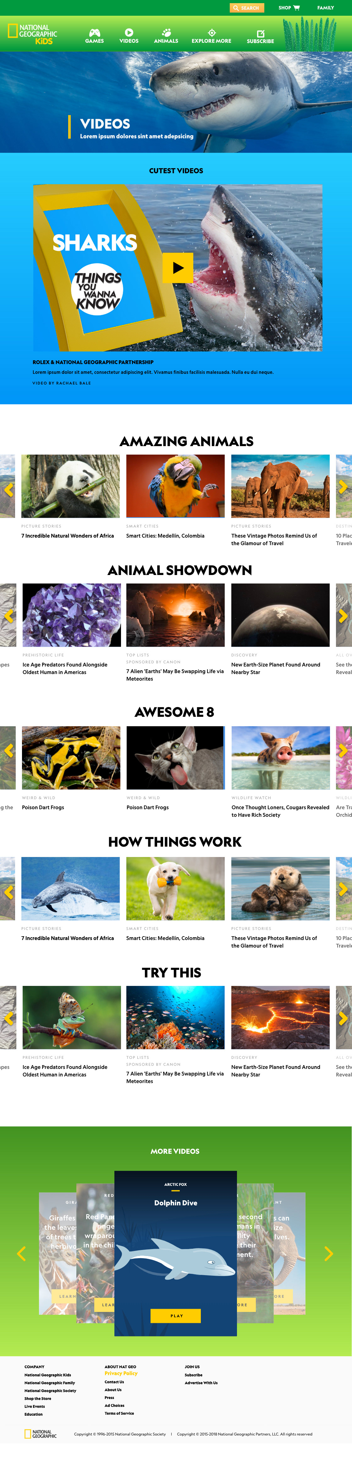
HOME SCREEN AND HUBS
All of the new screens fit the visual brand identity of Nat Geo Kids and were a refreshing change from the former templates. Some of the new components like the photo card stack and newer carousels gave us an opportunity for more visual prompts to engage the audience.
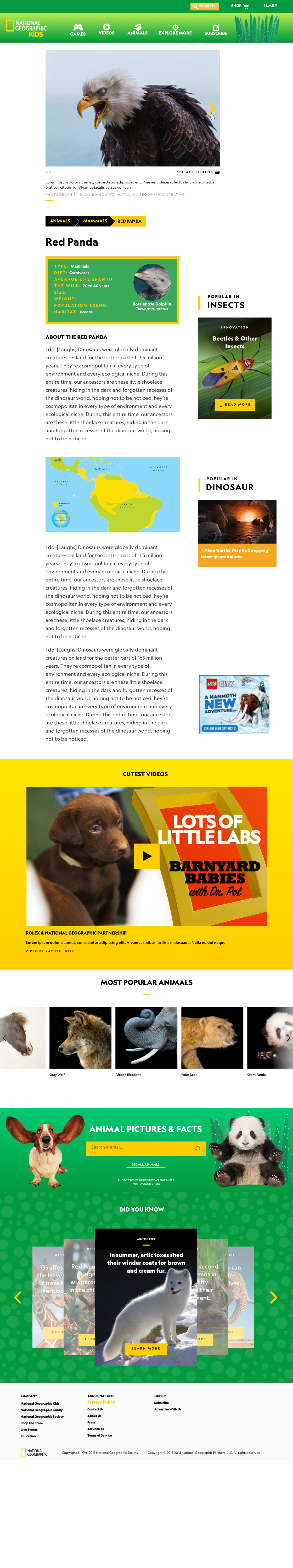
ARTICLE PAGES
The article pages below were developed to specifically accommodate our content needs.
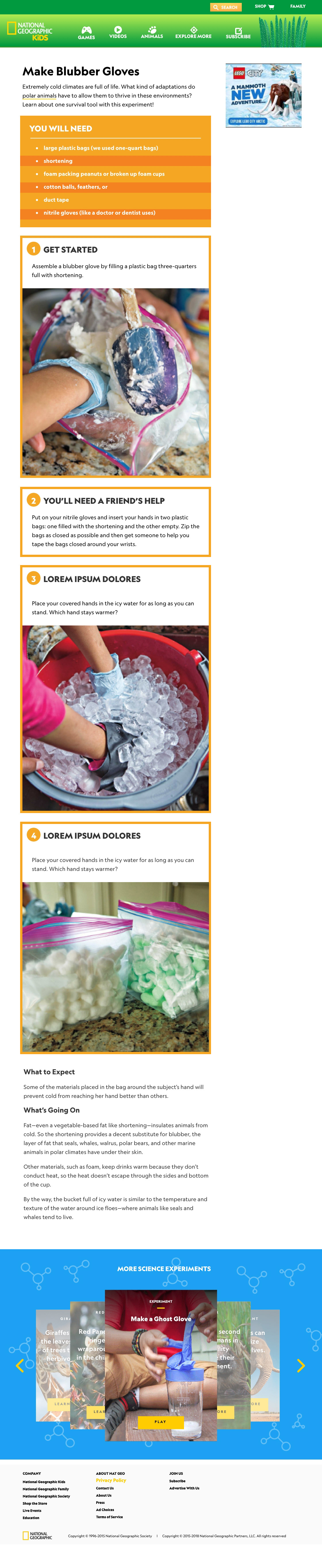
We wanted a new article component that we called the listicle for the highly visual reference articles that are a staple of natgeokids.com. We also thought these would be a great fit for science experiments (Make Blubber Gloves). Both article pages were designed to accommodate right rail ads that would scroll with the user.
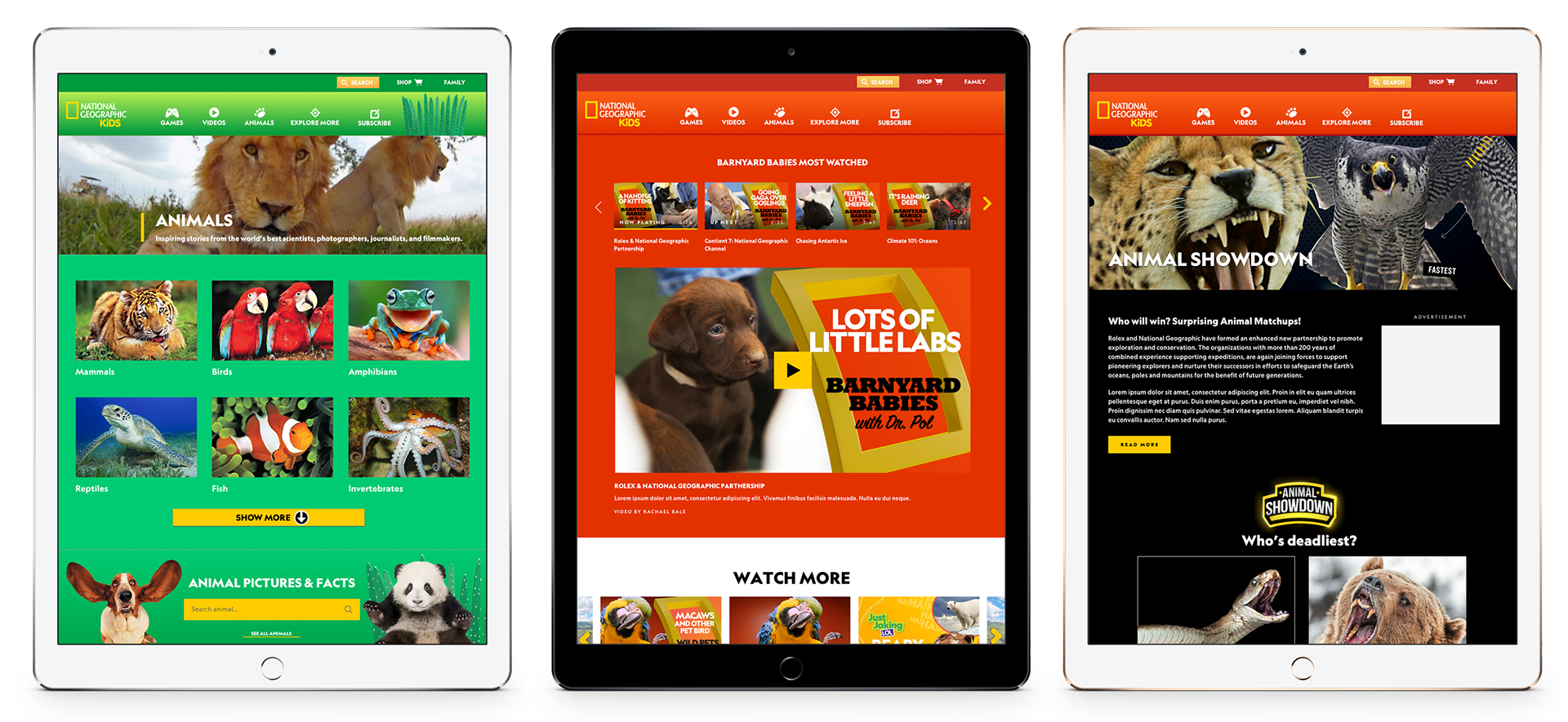
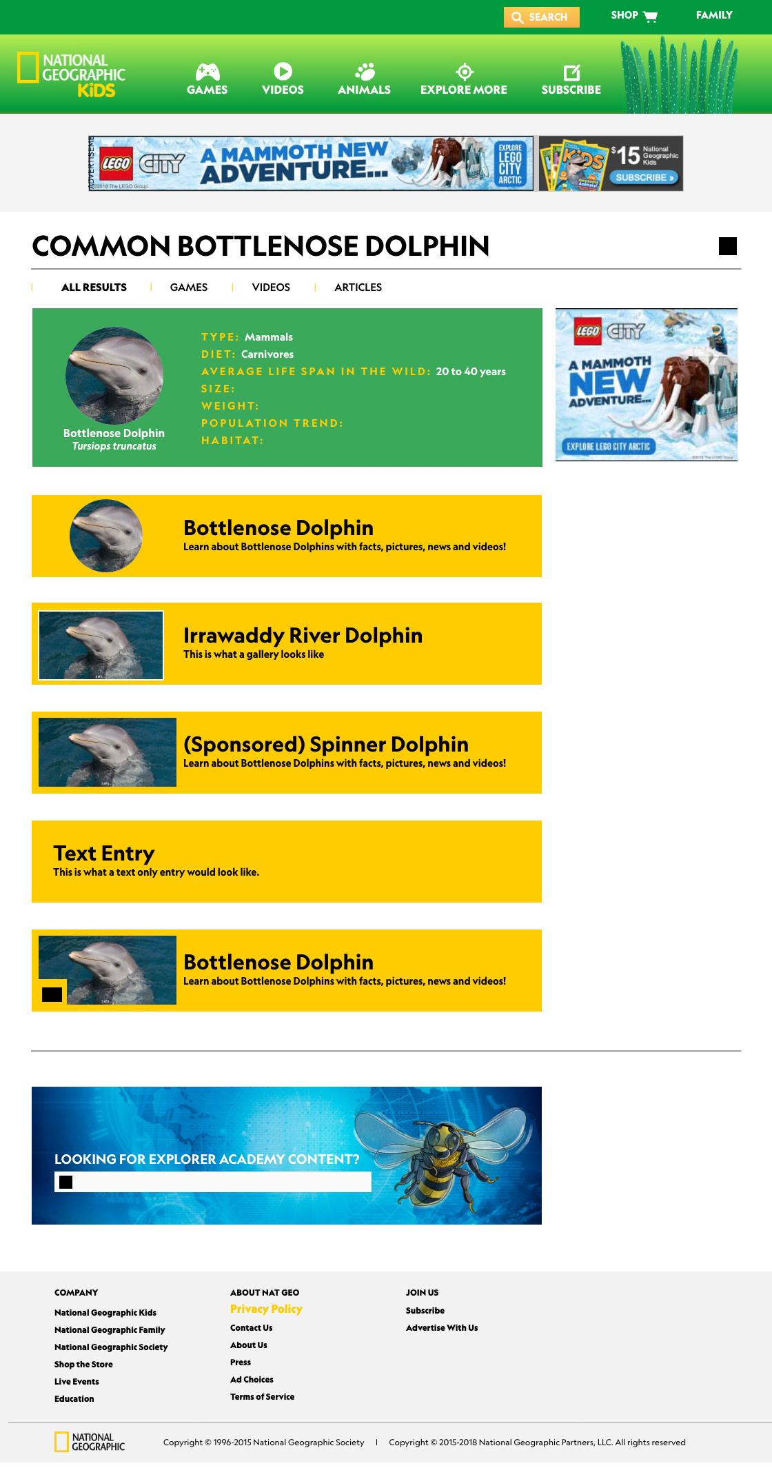
I also redesigned the animal pages so that kids had breadcrumb navigation that classified the animals in their correct animal Kingdom.
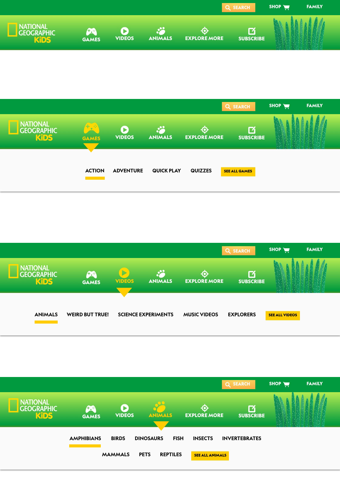
NAVIGATION
We already knew from previous research that kids don't use hidden nav (see navigation project here) so we used a simpler icon approach with a hover color change and a dropdown menu to expose the different areas of the site.
The tophat and navigation are sticky on both large and small screens. In some instances the secondary nav was two lines. The secondary nav drops down on hover.
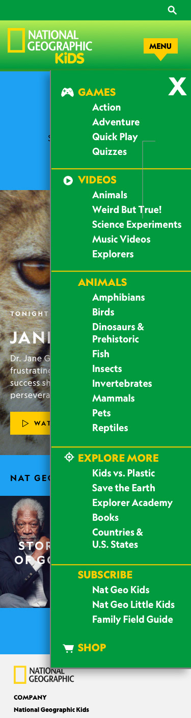
MOBILE NAVIGATION
The navigation was more difficult to expose on a small screen so we made the menu button yellow and more visible with an arrow for a cue. Since most of our users were using our site during school hours on a laptop or desktop computer, we thought this approach was acceptable.
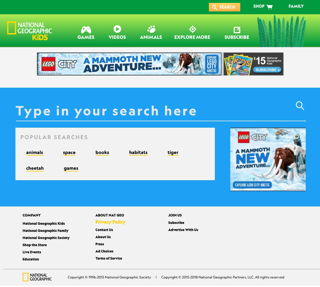
SEARCH PAGES
Since the search function was so commonly used, we redesigned it to include a visual search results page that differed from the main site’s search function.
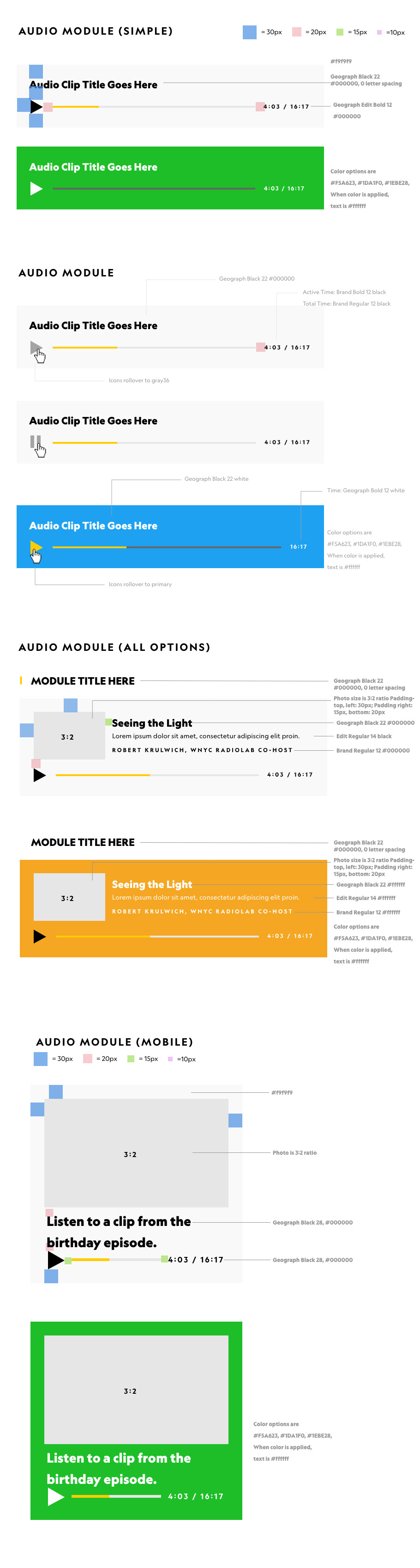
Once all the visual designs were completed and approved, I wrote the css elements notes for the external front end development team. This Audio Module is one example.