UX/UI Navigation Project
PROBLEM: Users (kids ages 9-12) weren’t using the Go ball menu and infinite scroll seemed overwhelming. User research found that users didn’t realize the ball was a menu even though it animated on hover. We first tried to change the word GO to menu but the problem persisted.
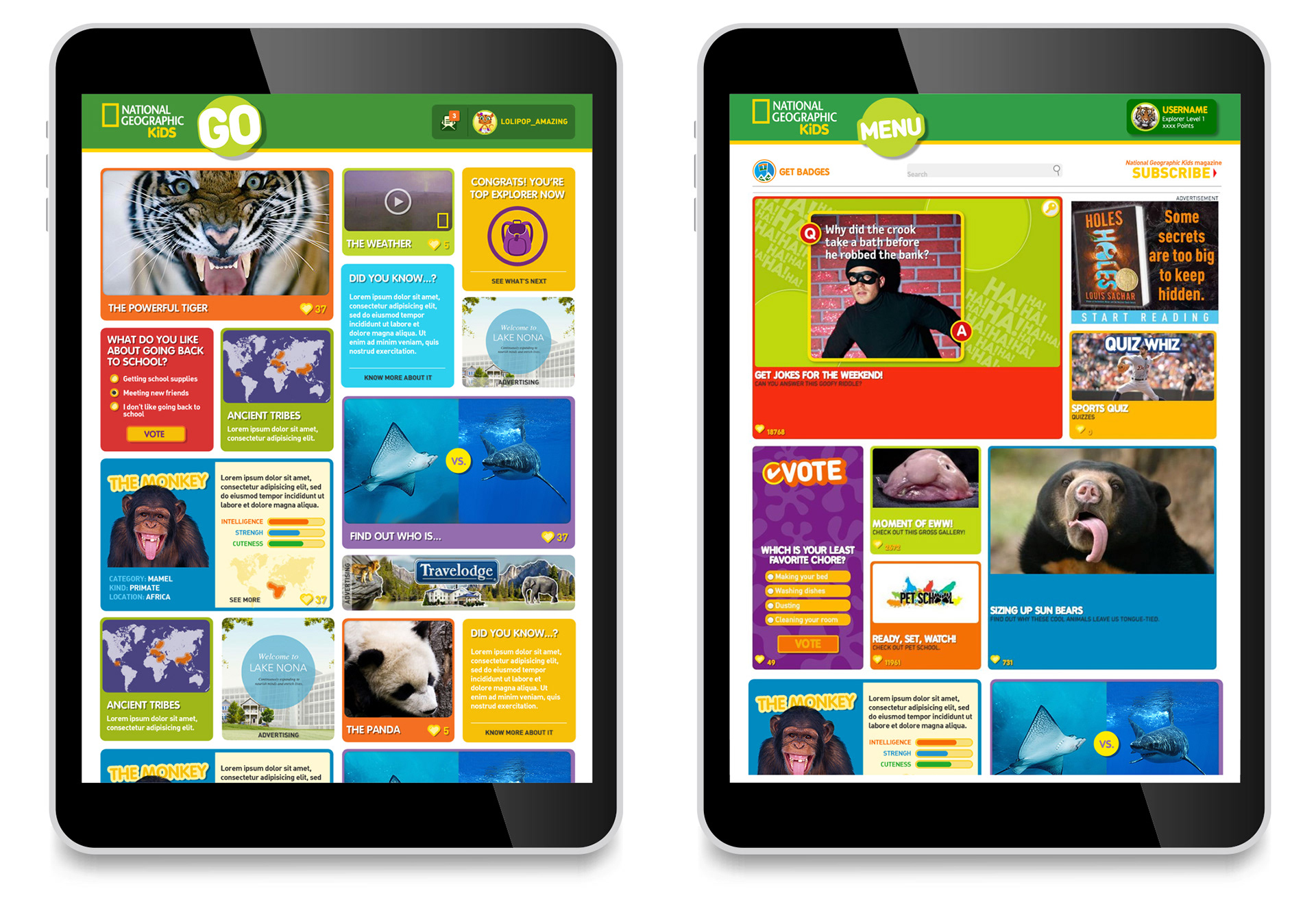
SOLUTION: We decided to break out the navigation and make the top hat sticky so it traveled with the user as they scrolled. We also decided to turn off infinite scroll so that the content wasn’t so overwhelming for the user and end the pages with either a collapsed or full footer. We also moved the search function above the top hat so that it looked like a site-wide search instead of page specific. We also decided to add a rewards area where users would collect badges for more deeply engaging in the site. (See badge project here.)
Large screen test 1
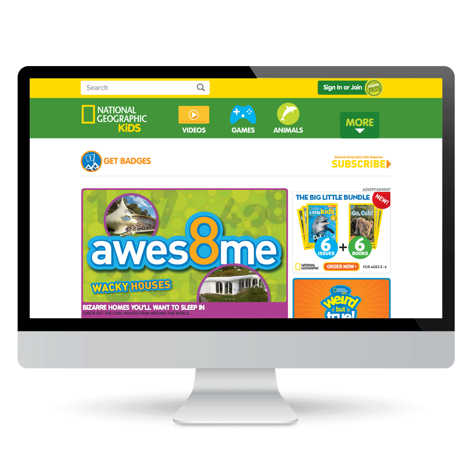
Exposed navigation with large buttons for main areas of site with hidden navigation for secondary features. Subscribe button moves to under sign-in and join. (Wireframes and visual designs done in Adobe Indesign, simple animations in Photoshop.)
Large screen test 2
Exposed navigation with smaller icons and hidden navigation for secondary features. Subscribe button remains static.
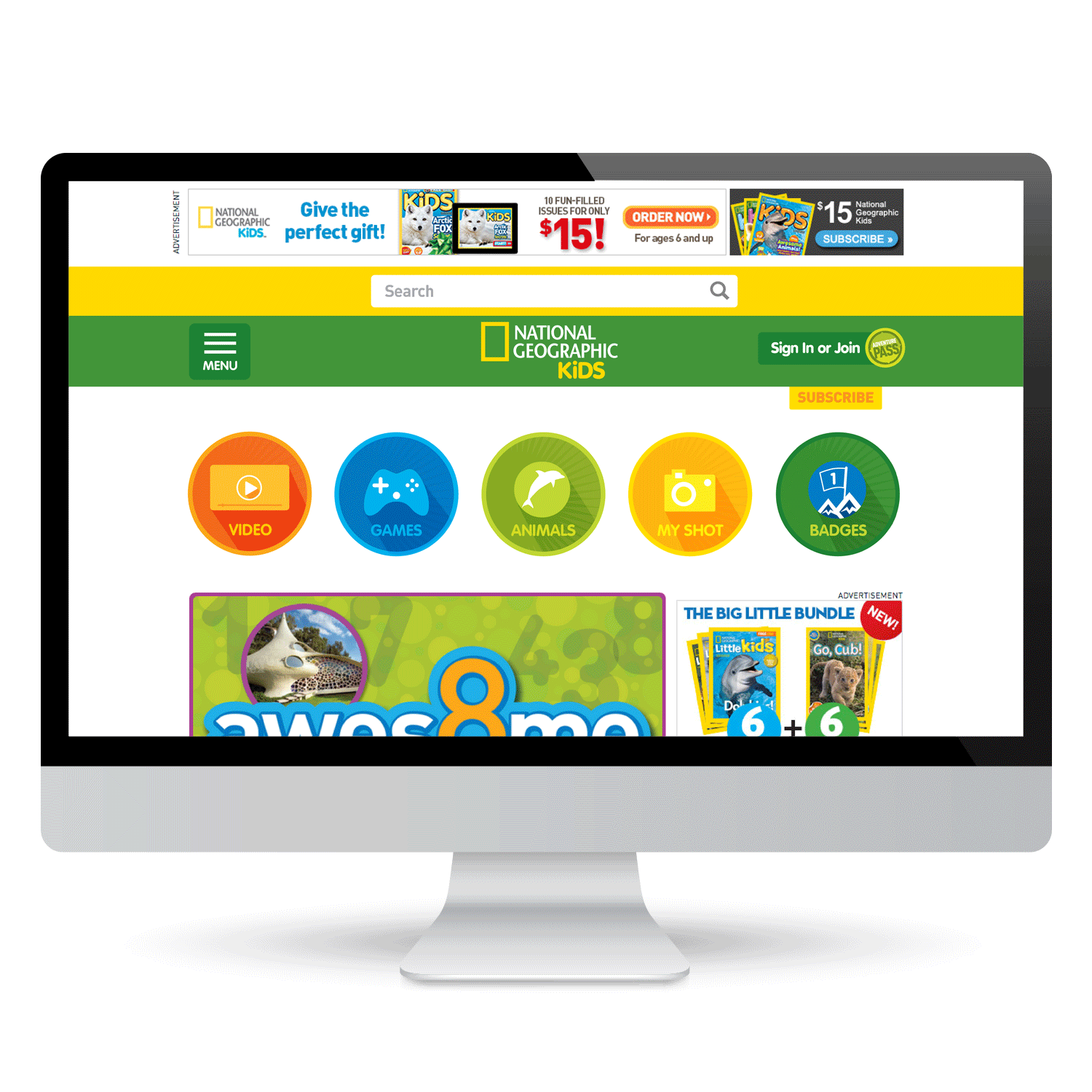
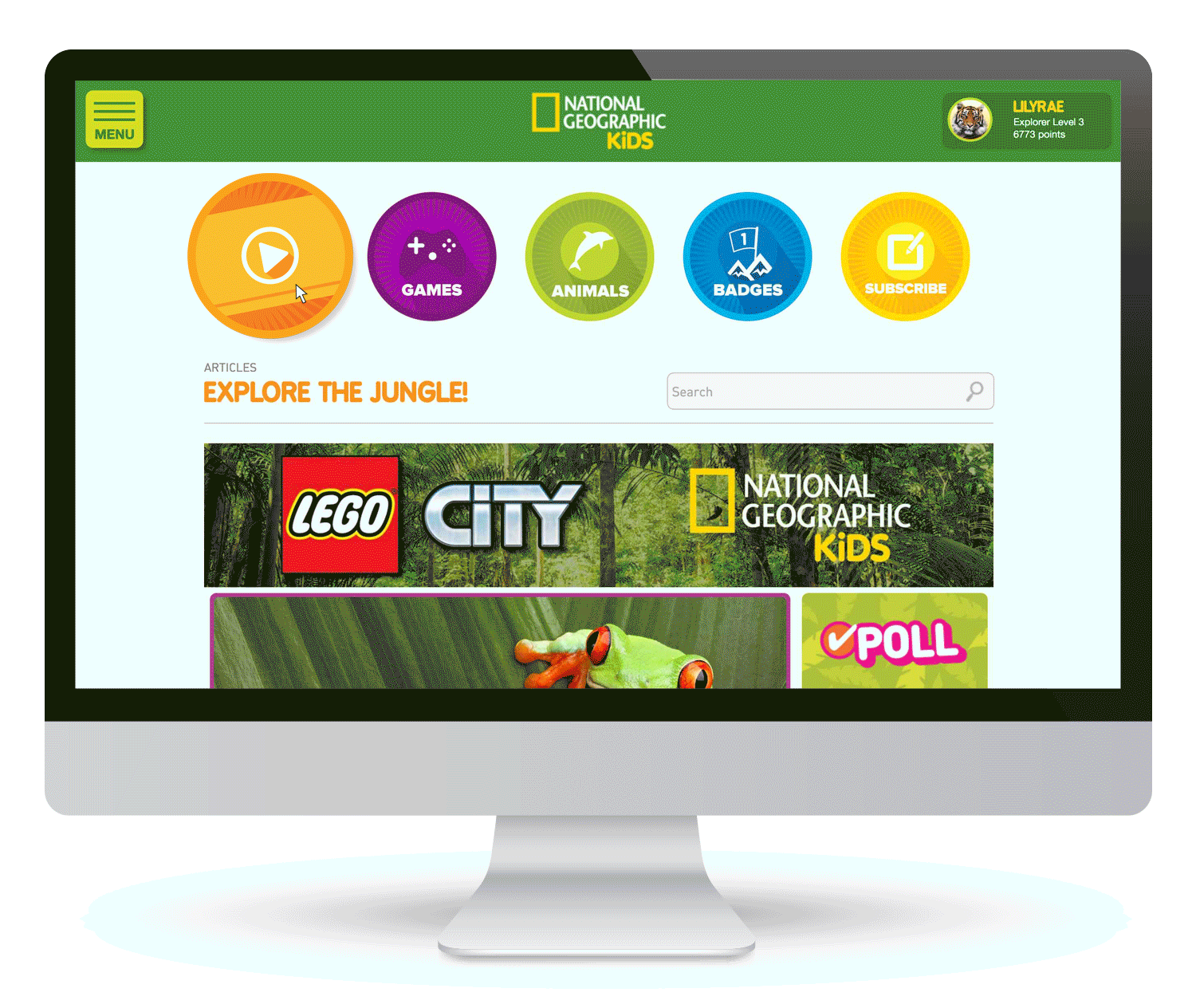
FINAL NAVIGATION
Testing of the designs revealed that users and stake holders would prefer both BADGES and SUBSCRIBE as their own large button on the navigation so we moved the less-used MyShot from the first test to the hidden menu. The screen below shows the final navigation on a sponsored article page with a user signed-in.
Unfortunately we didn't have the resources to move the search bar above the top hat so it remained where it had previously been on the site.
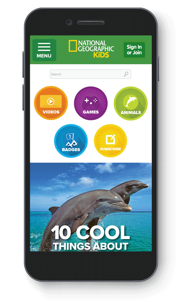
Mobile design with exposed navigation, deeper hidden menu and user signed out.
RESULT
Exposing the navigation led to users exploring the site instead of directly going to search which increased user activity over the entire site.